Posts

My wood engraving journey

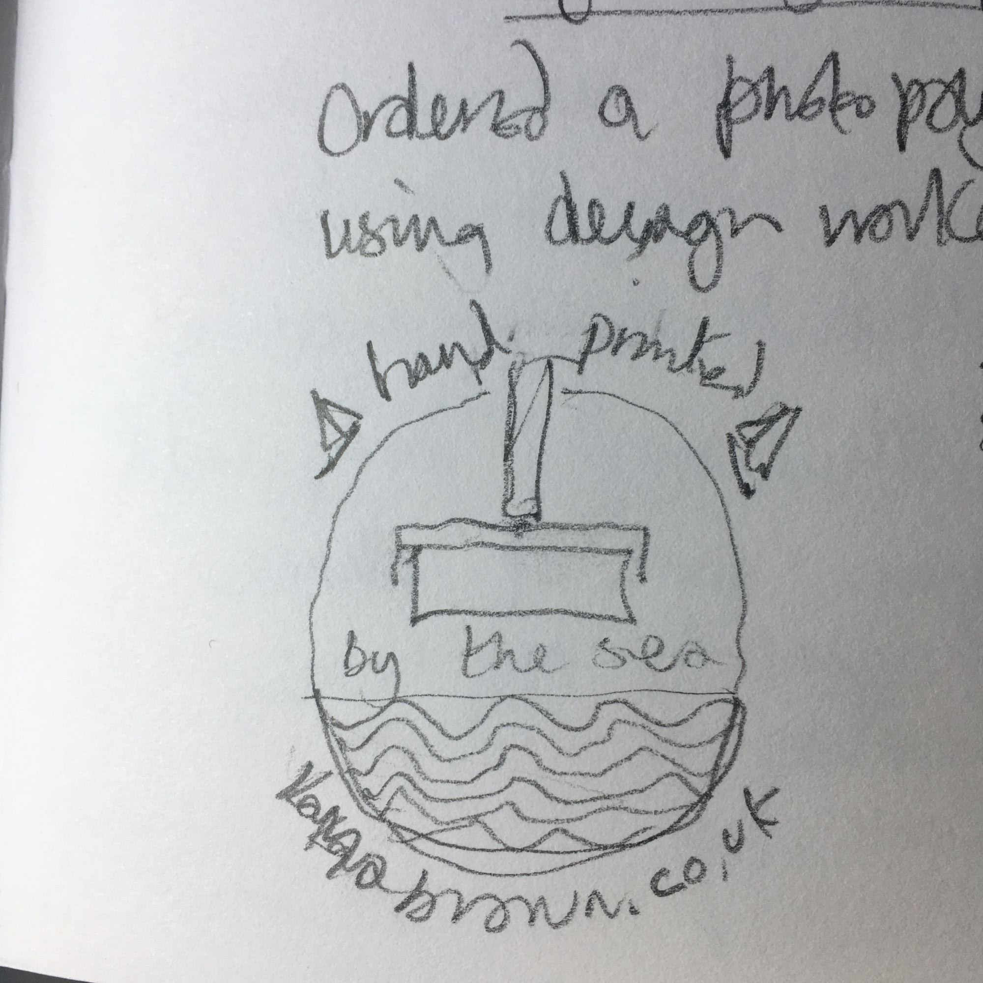
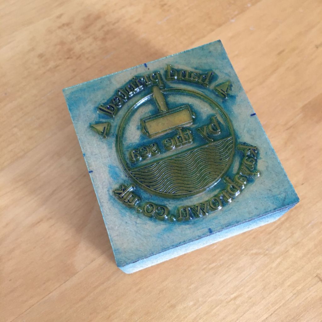
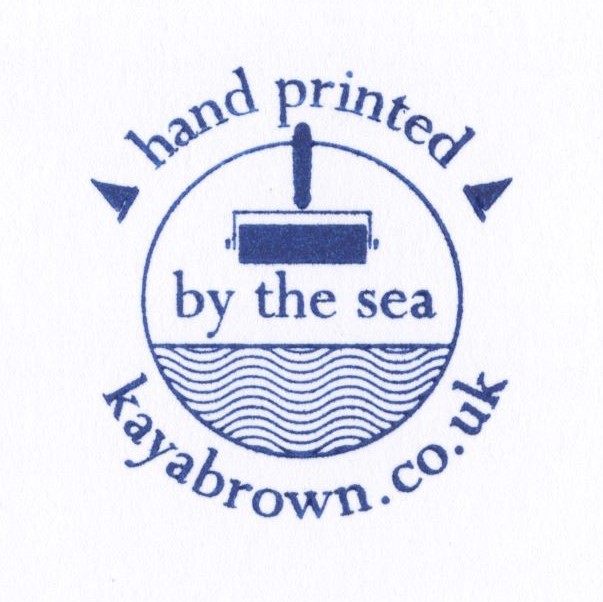
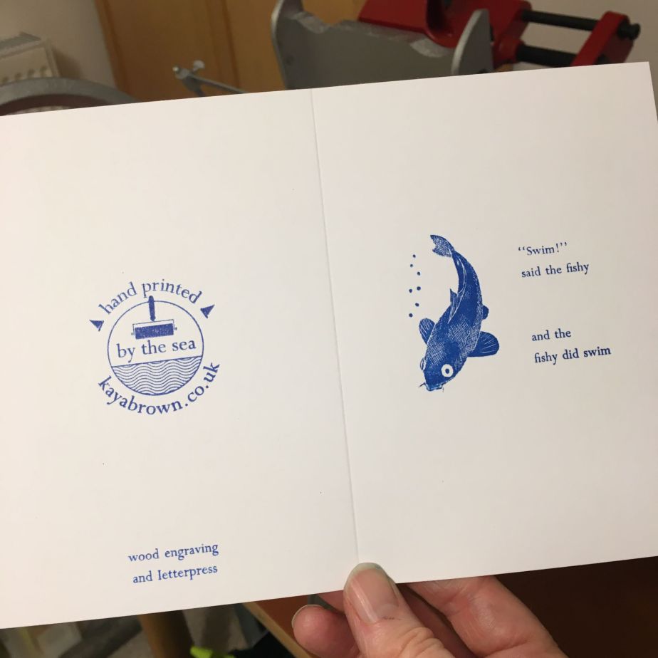
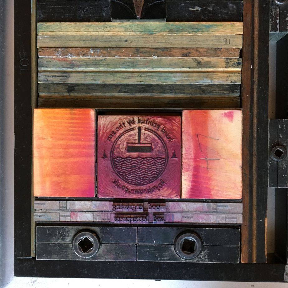
The past few years have seen a major change in my life – namely learning to make prints, which is now at the heart of all I do, and a passion for using wood as a matrix. In this blog I consider that journey and how my interest in wood engraving has developed.

Wood engraving is the only form of printmaking that can be said to have been invented in England. Often referred to as ‘drawing with light’ the technique focuses attention on observation and drawing skills as well as a love of the tactile qualities of wood, a steady hand and good eyesight! Its roots go back to the late 1700’s when Thomas Bewick adapted tools used by metal engravers and started to use hard endgrain woods such as boxwood. He became well known during his lifetime for his exquisite engravings of birds and other animals, printed in some of the earliest mass produced illustrated books that influenced authors Charlotte Bronte, Charles Kingsley and Beatrix Potter, and confirmed him as one of our first naturalists.

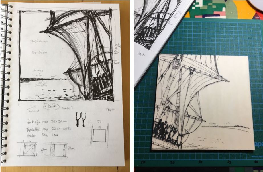
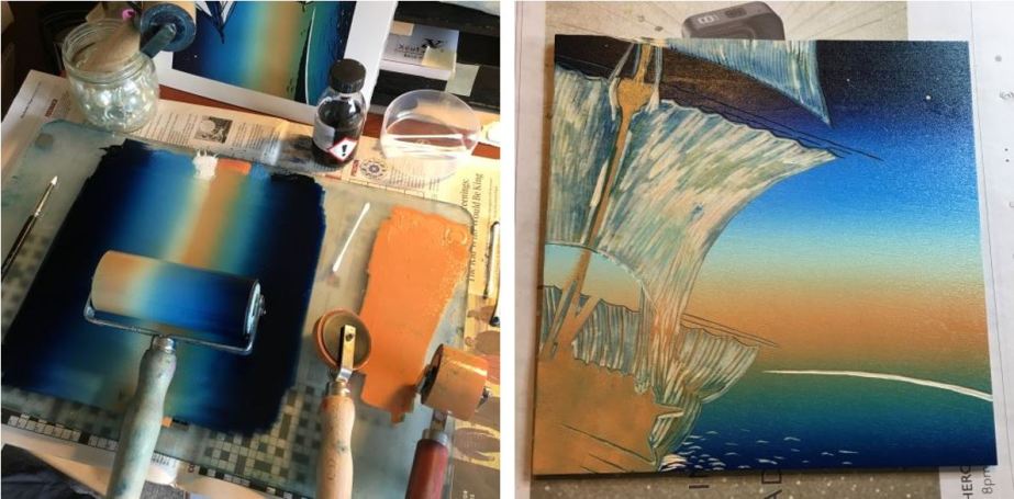
My enthusiasm for wood engravings was sparked through a realisation that this technique suits my obsession with detail (no doubt as a result of years practicing as an architect!). The saying goes that you don’t choose wood engraving but it chooses you. I didn’t find wood engravings particularly attractive, they seemed old fashioned and lacking in colour, but all that has changed as I have explored it’s 250 year history, being particularly attracted to the bold black and white designs that emerged during the Modernist Movement. Now explorations in the use of colour, multi block and mixed media prints continue innovations in the technique.

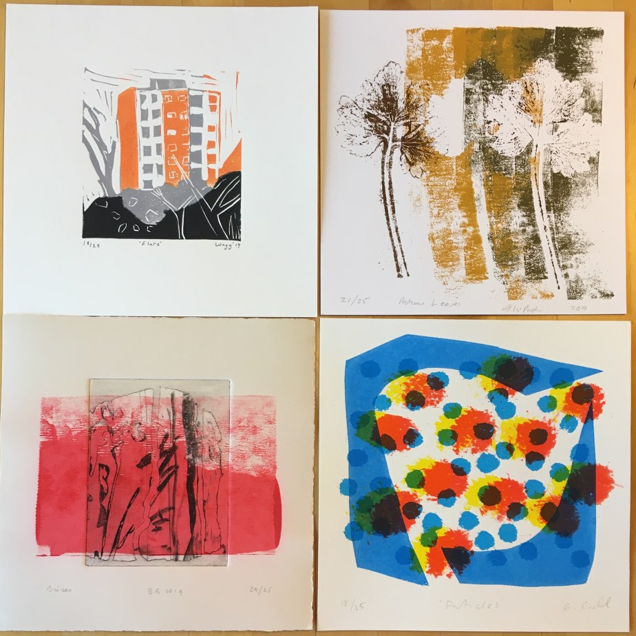
I had not done any printmaking at all until my first taster in 2012, when I tried mono-printing with Marian Taylor on a mixed media course at St Ives School of Painting, studying the work of Wilhemina Barns-Graham. In 2015 an urban sketcher friend introduced me to Sarah Mander at Red Hot Press (RHP) in Southampton, where, following a taster session in mono-printing with fellow urban sketchers, I signed up for a beginners course introducing linocut, card cuts, drypoint and etching techniques, and sold my first print – a chine colle and linocut of Smeaton’s Tower!

In 2017 I decided to join RHP and their members group Cowprint Artists’ Group, and signed up for their 30 week Foundation Course. This signified the start of an exciting and fulfilling new phase in my life, developing long lasting friendships with like-minded individuals passionate about printmaking and art.

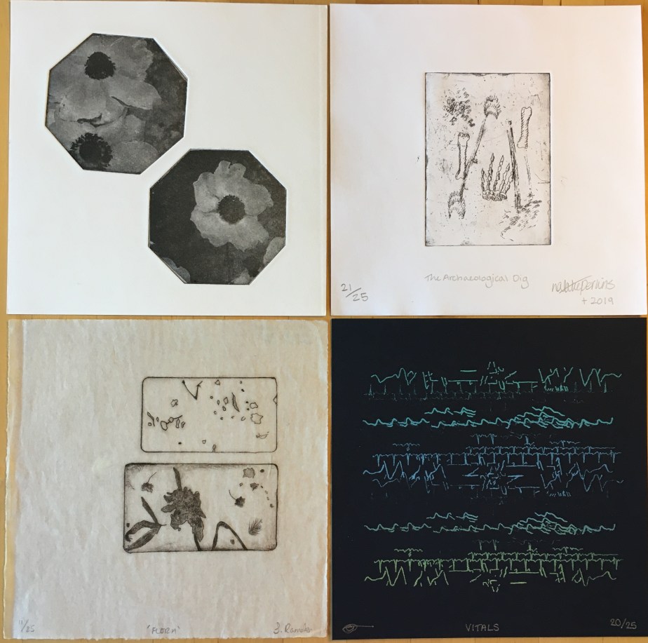
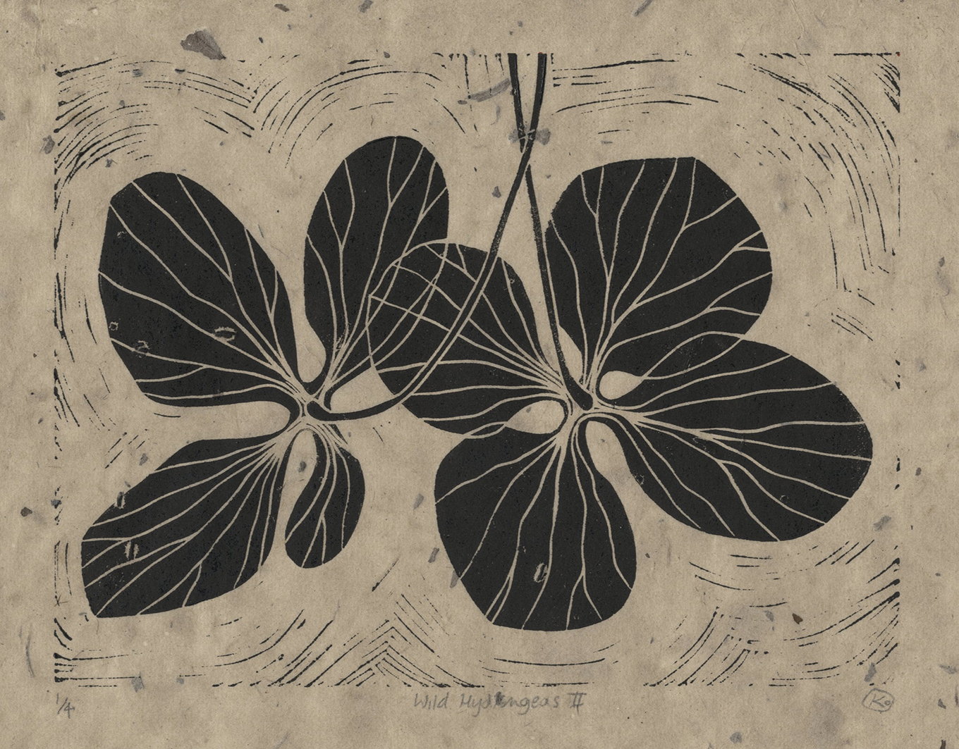
During this course we had guest tutoring from Kate Dicker, a wood engraver and an elected member of the Society of Wood Engravers (SWE). I was intrigued by the detailed structure of dried hydrangea flowers and created a number of prints in different techniques (including Wild Hydrangeas II printed on Lokta paper) studying the flowers at different scales from macro to micro. Working in lino I struggled to get the detail I wanted and seeing Kate’s graphically bold but detailed wood engravings I wondered if wood engraving might be the answer.

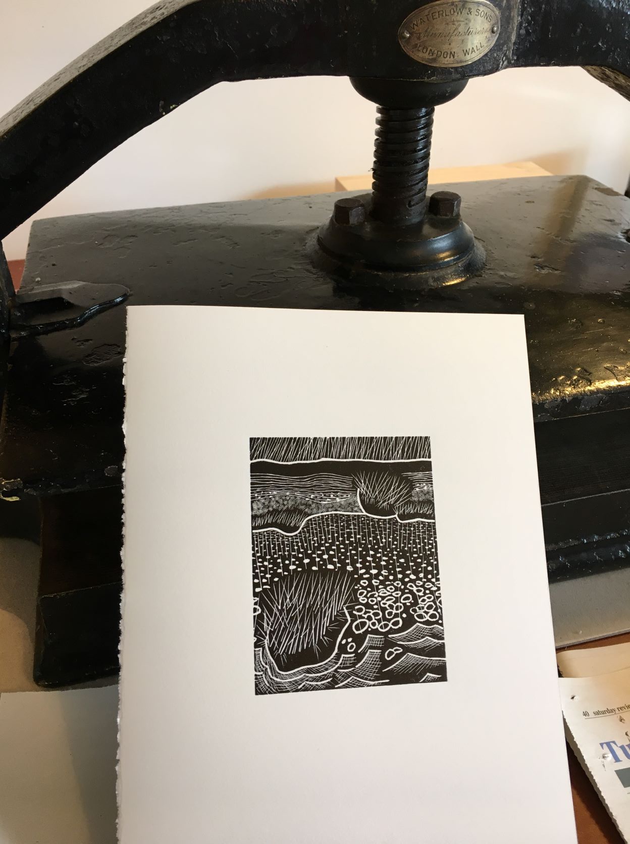
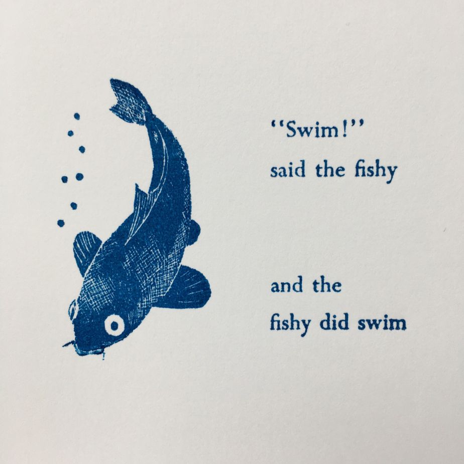
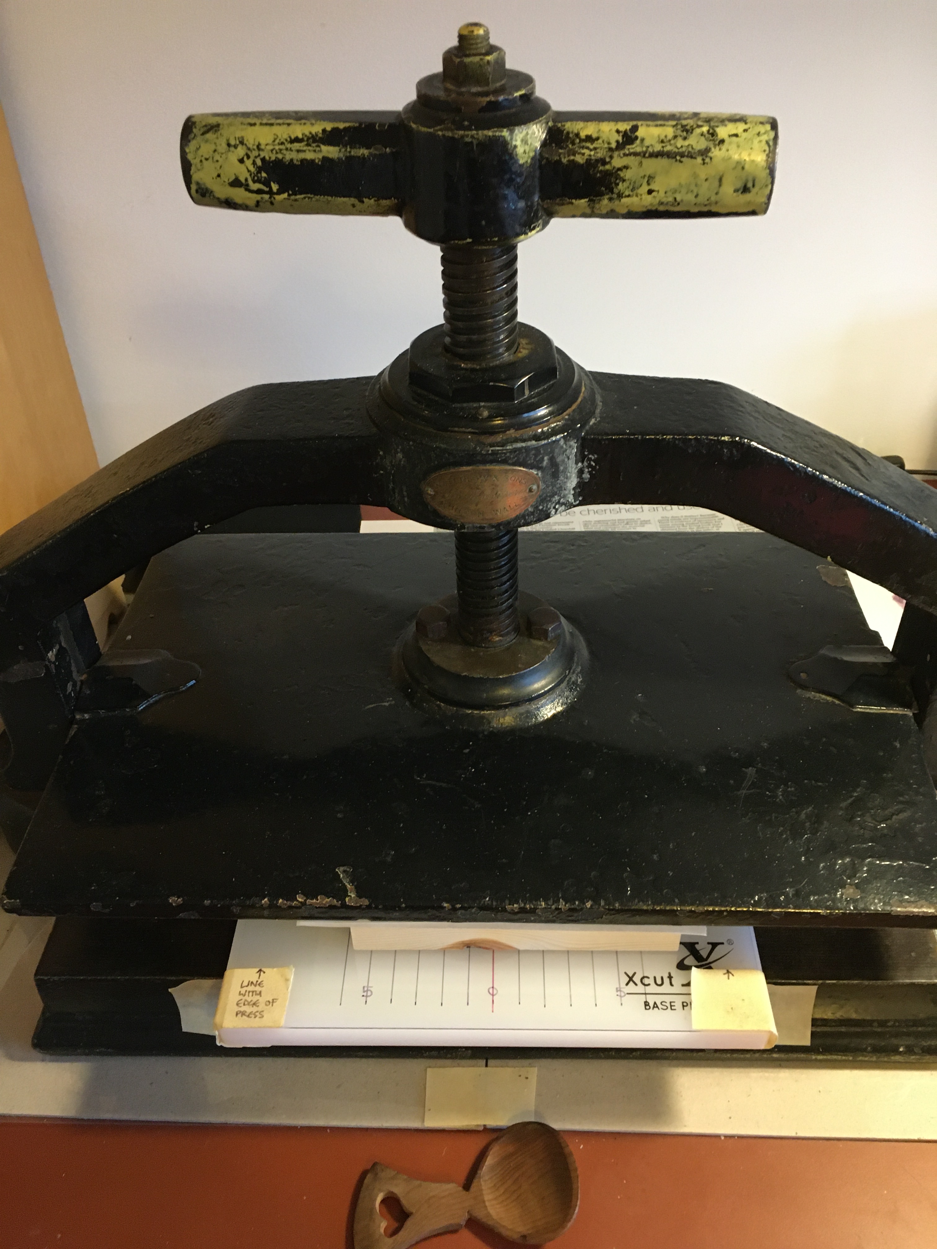
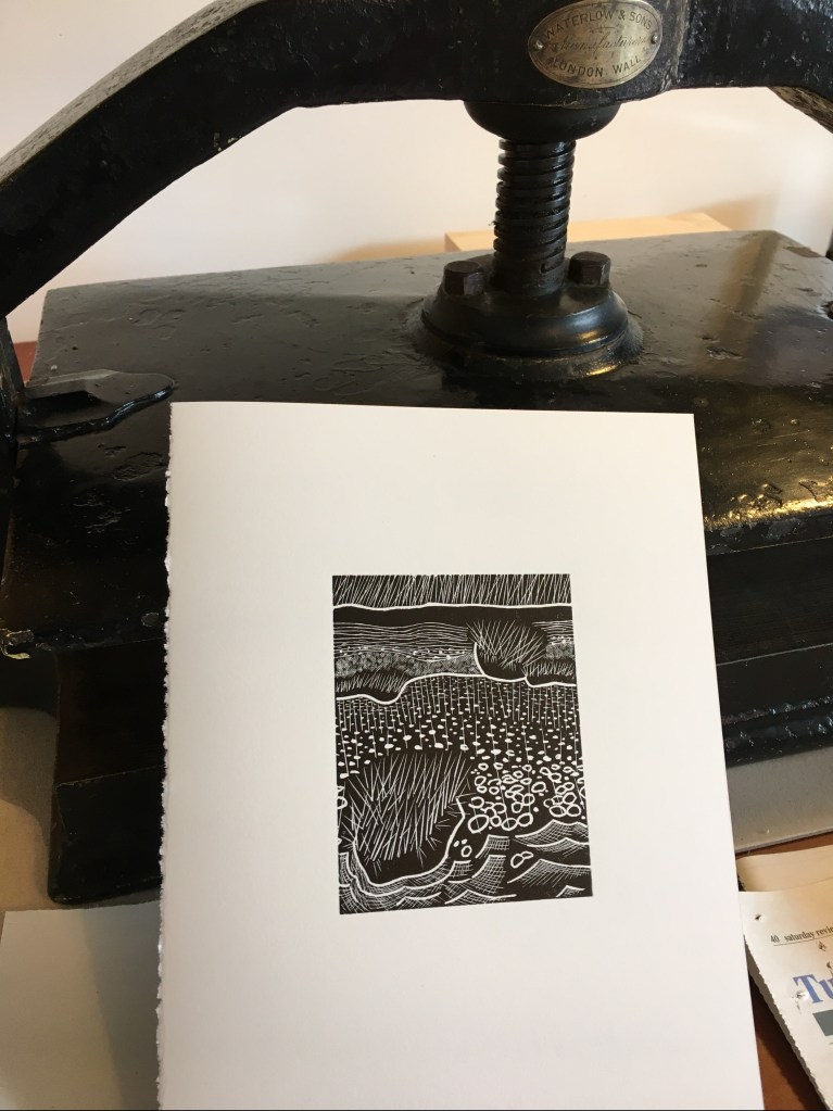
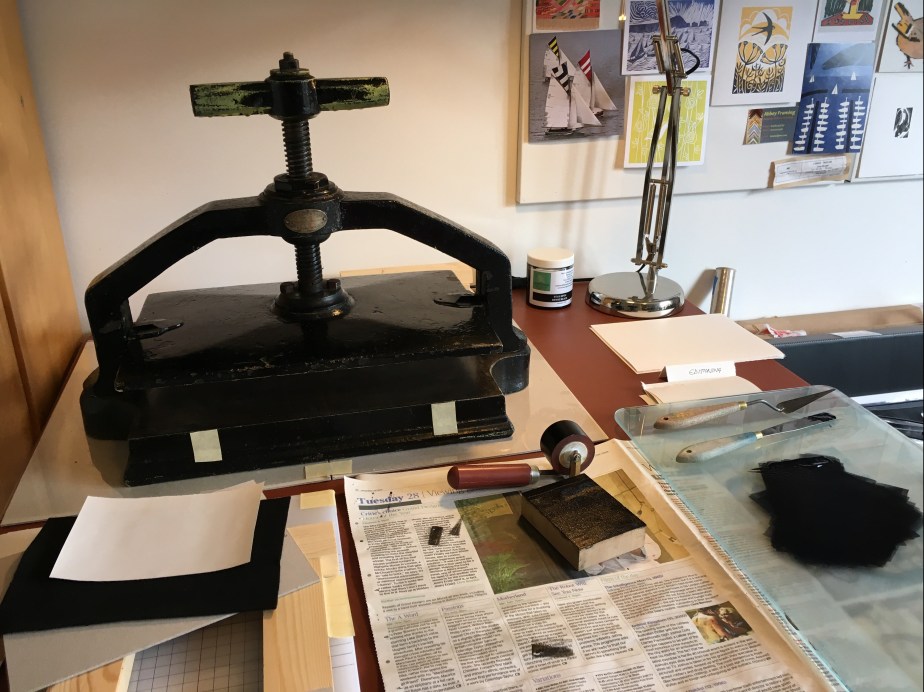
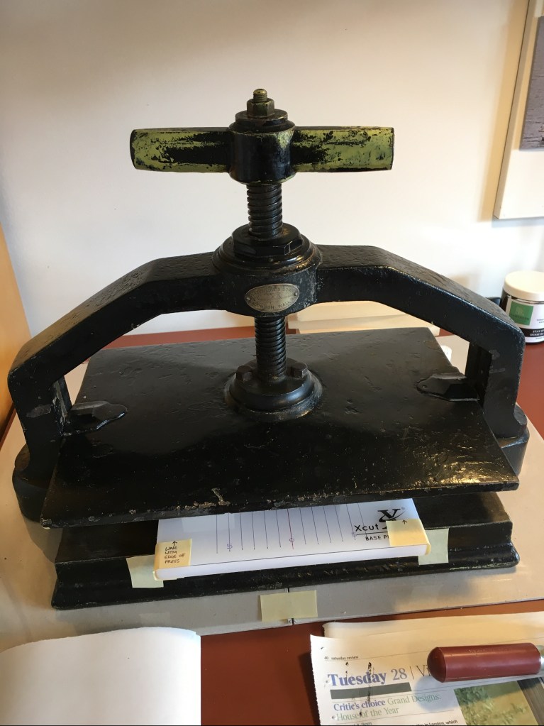
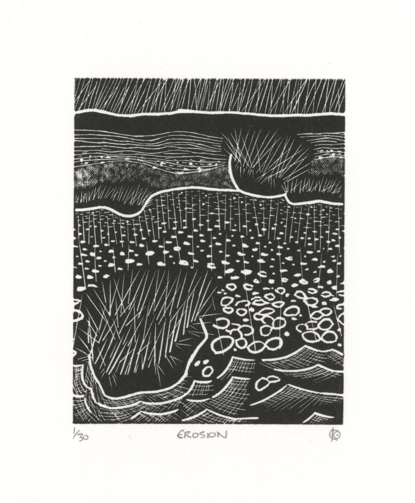
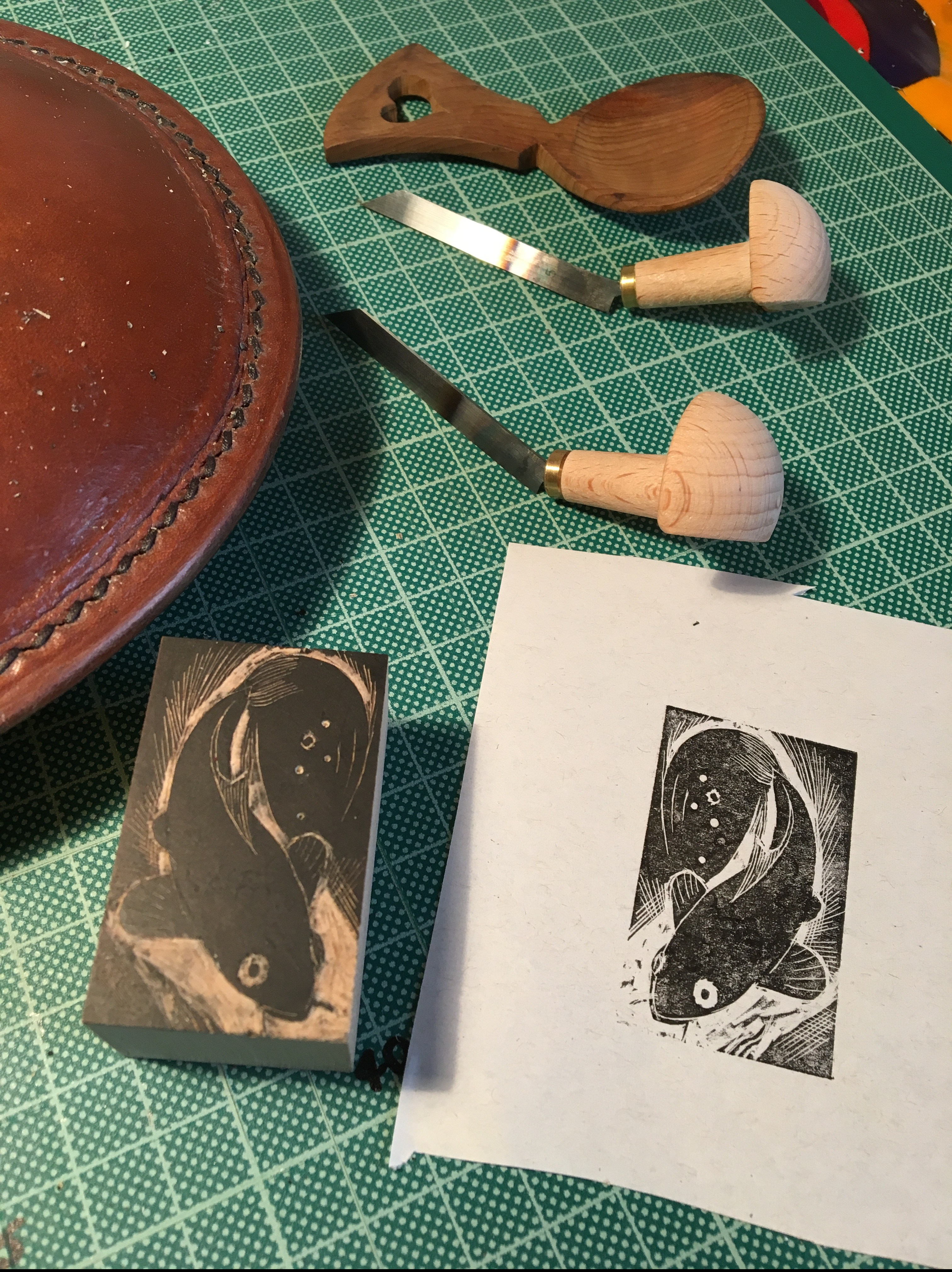
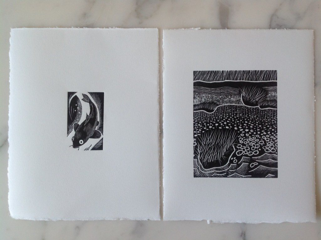
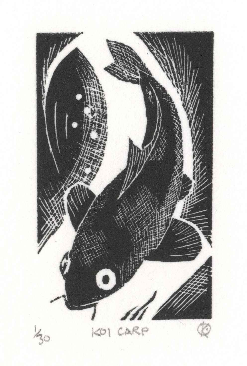
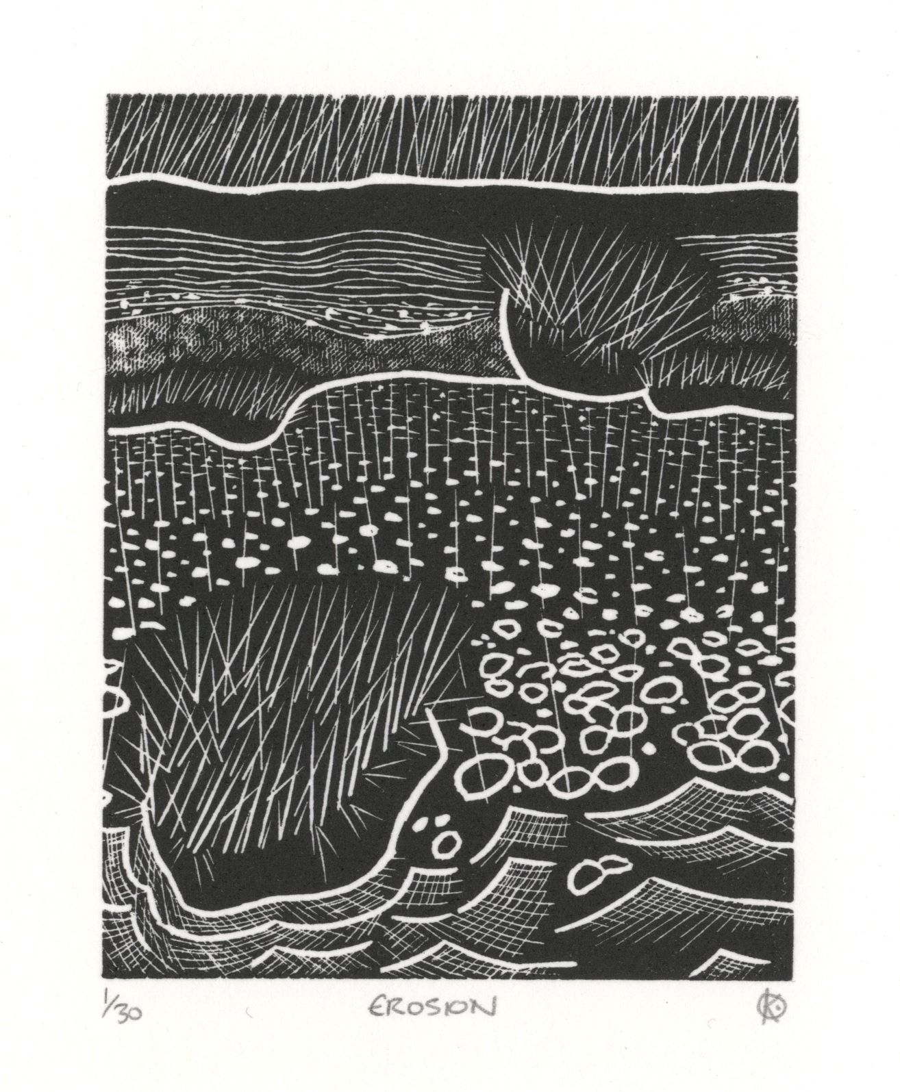
In 2018 Katherine Anteney at RHP asked Jutta Manser, a long term member of RHP and an elected member of SWE to run an introductory course early in 2019. I bought Simon Brett’s Wood Engraving – How To Do It book (which is excellent) and some tools to get started. Agnes Miller Parker’s bold studies of fish and animals, influenced my design for my first wood engraving Koi Carp . My second engraving, also created on Jutta’s course, was ‘Erosion’, a design influenced by the modernist pattern making of Geoffrey Wales and I was delighted when this was accepted in the St Barbe Open Exhibition, Lymington, in 2019. Both of these were editioned on an antique Waterlow copying press.

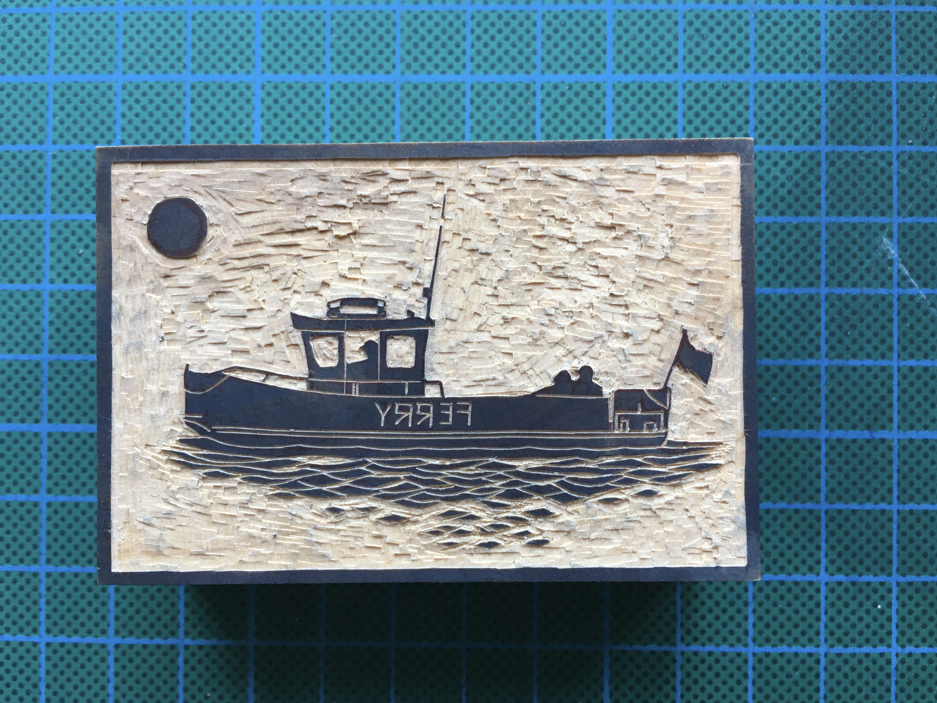
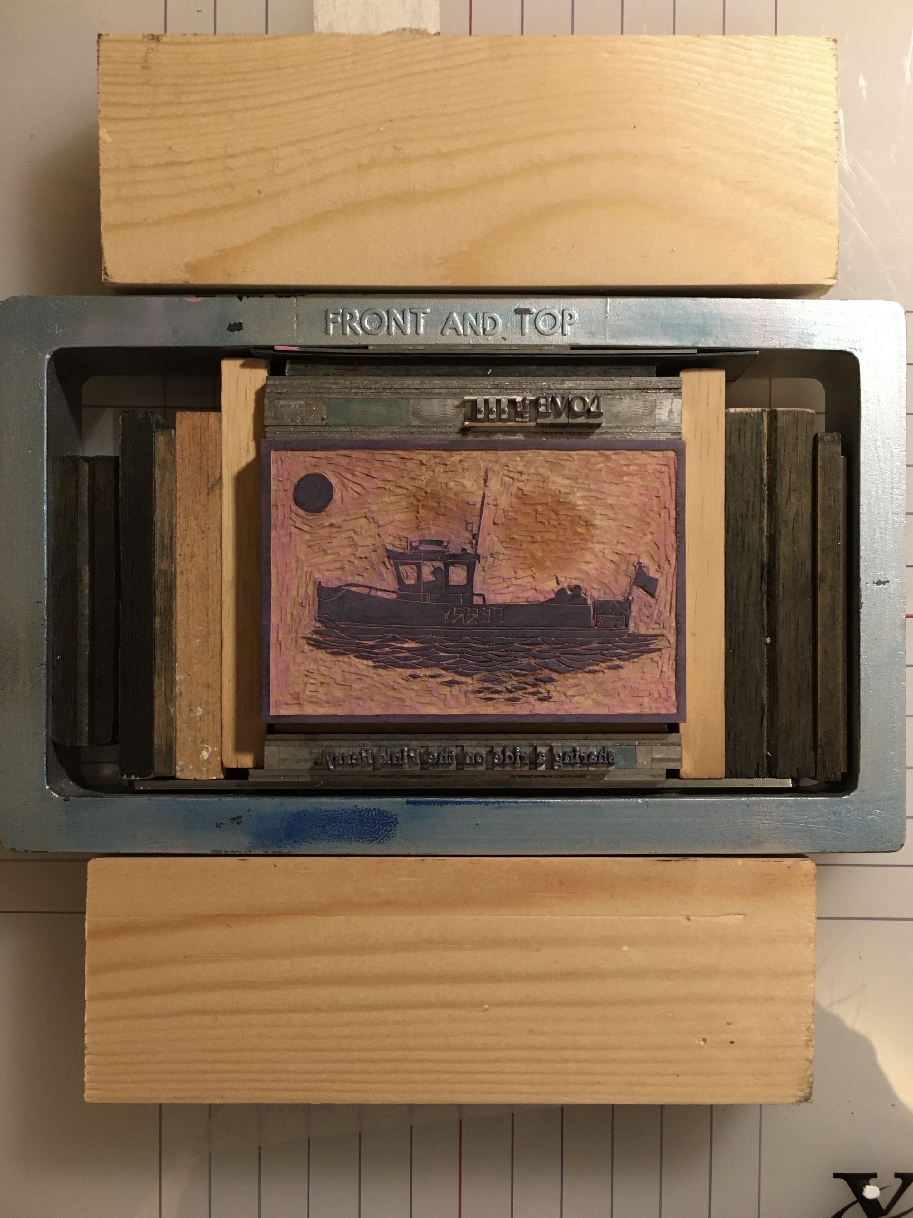
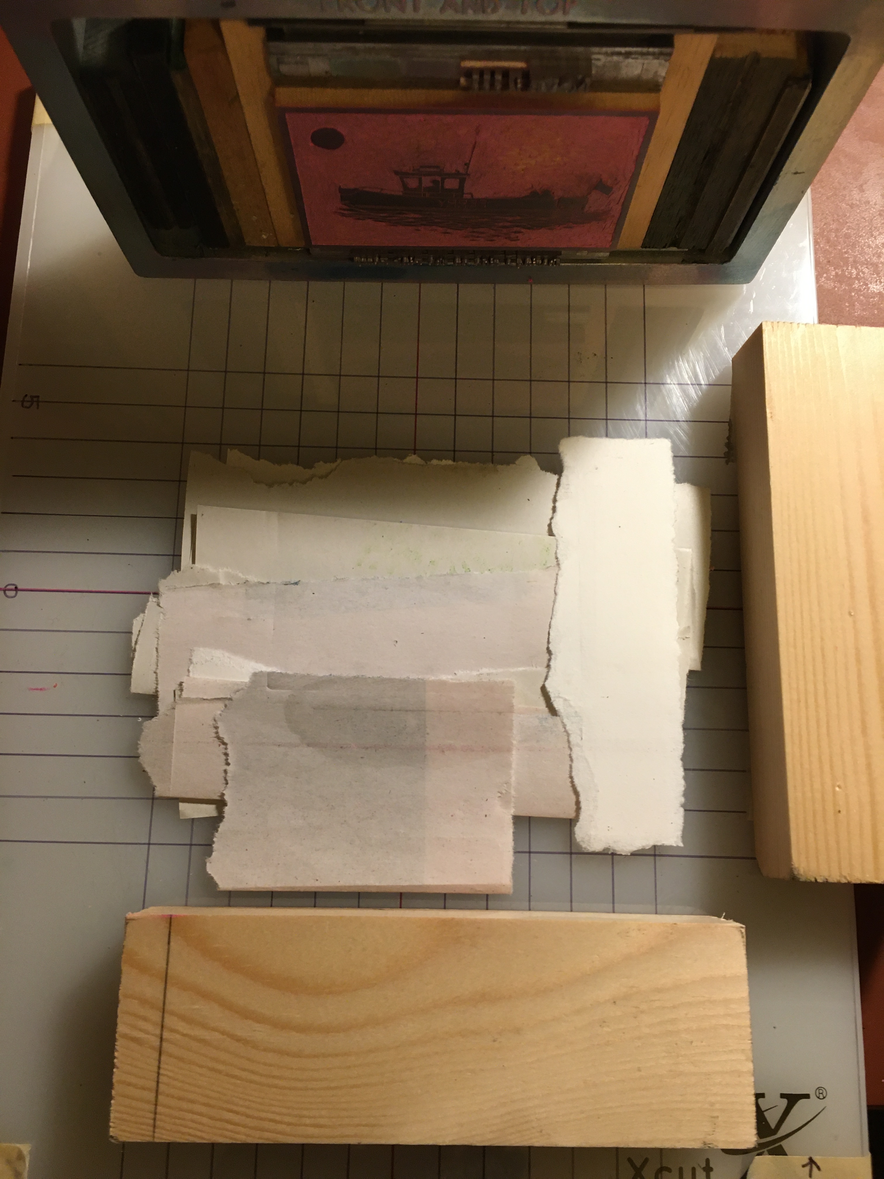
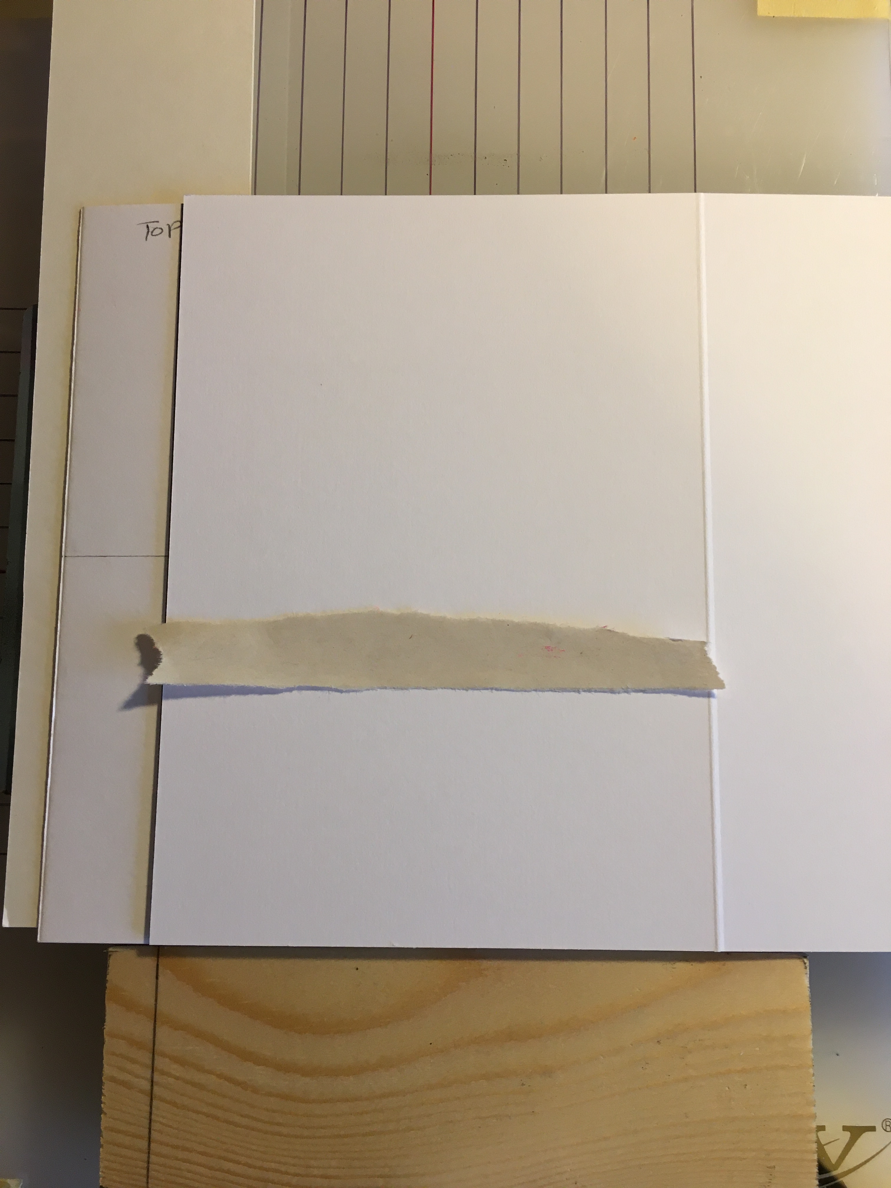
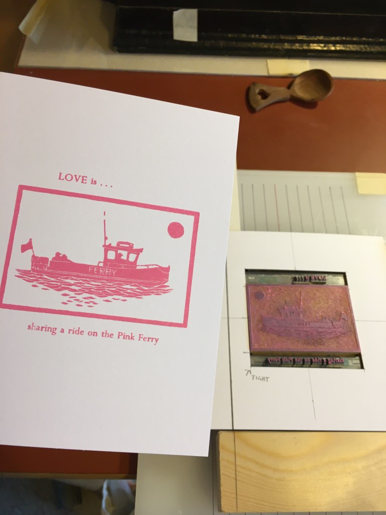
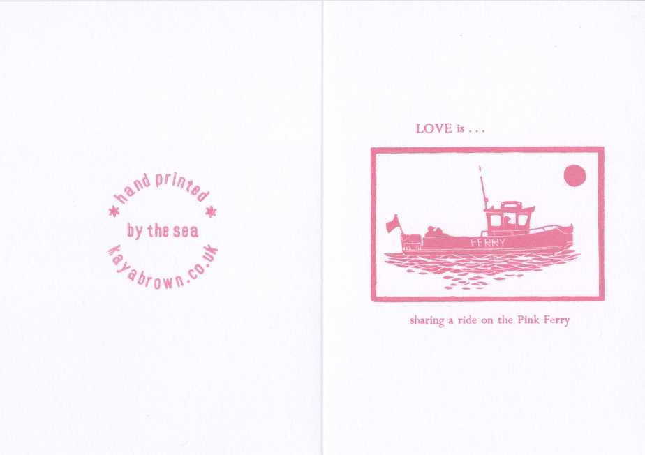
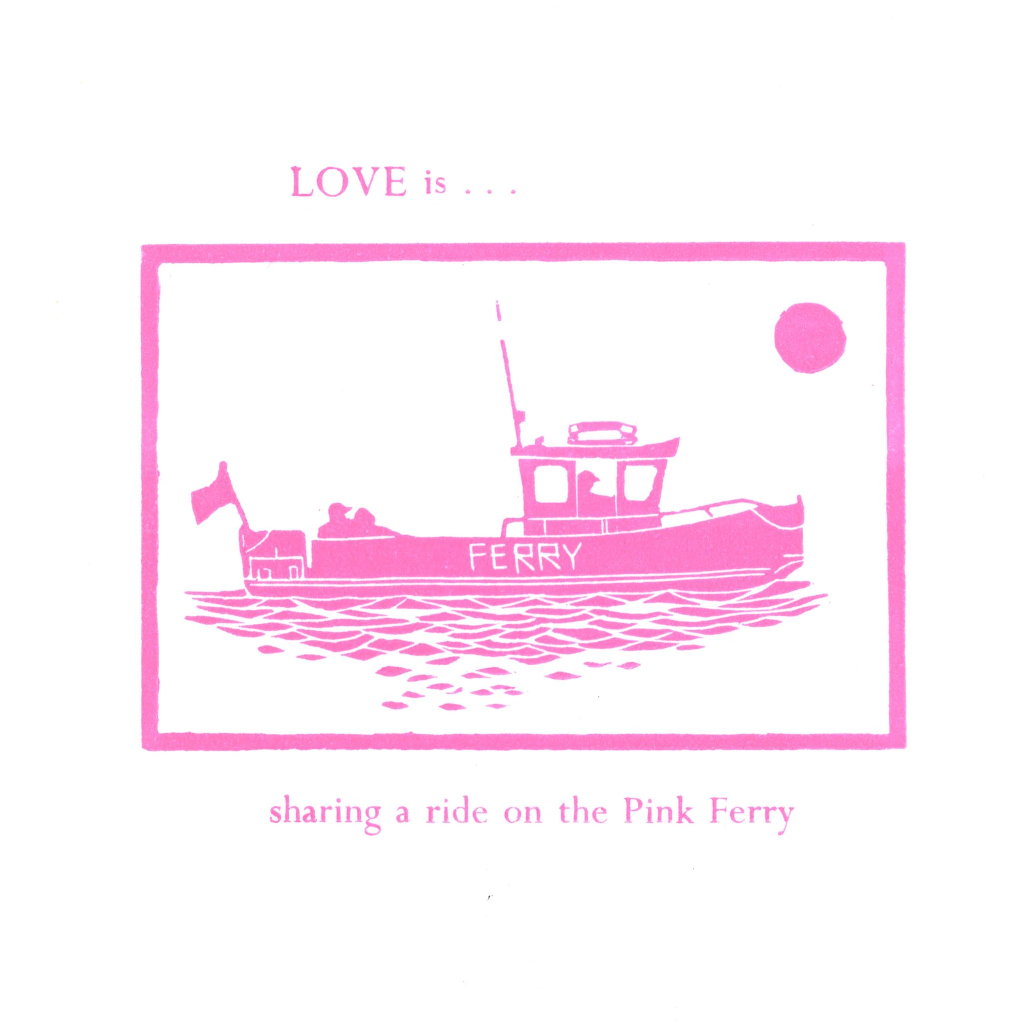
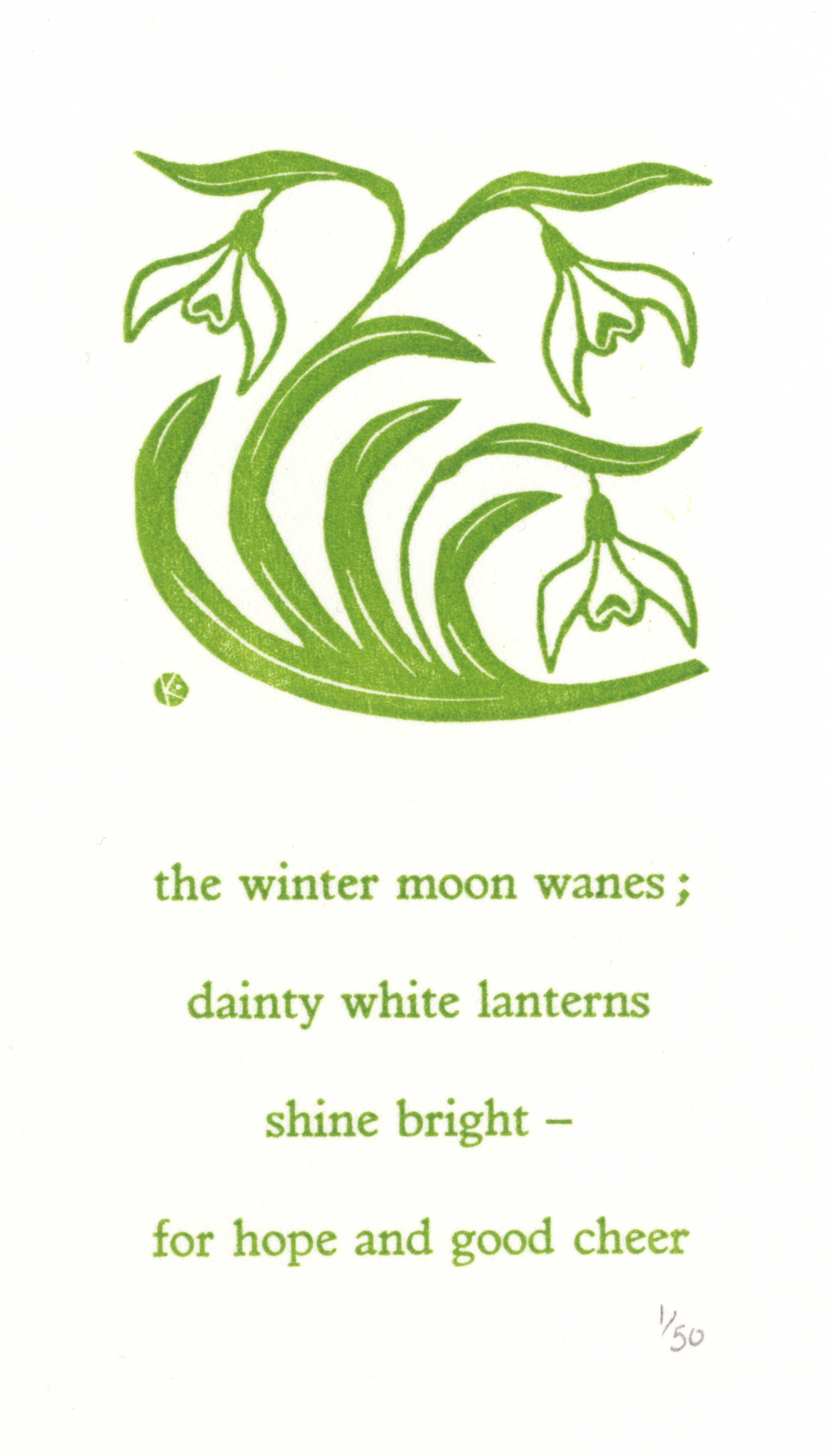
During the following couple of years I engraved a few small designs including ‘Love is … sharing a ride on the Pink Ferry’, set with type and printed as a card – so popular its now in its sixth edition! Other designs included ‘Snowdrops’ printed with a haiku poem I had composed (an occasional pastime!) influenced by the engravings of Lucien Pissarro, a founding member of the SWE.

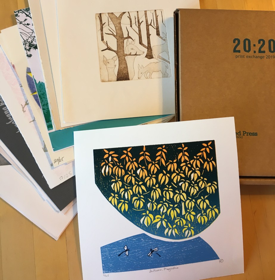
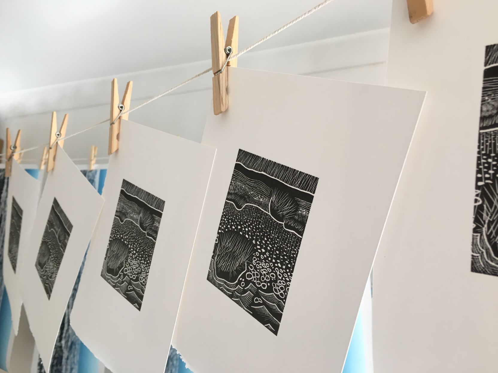
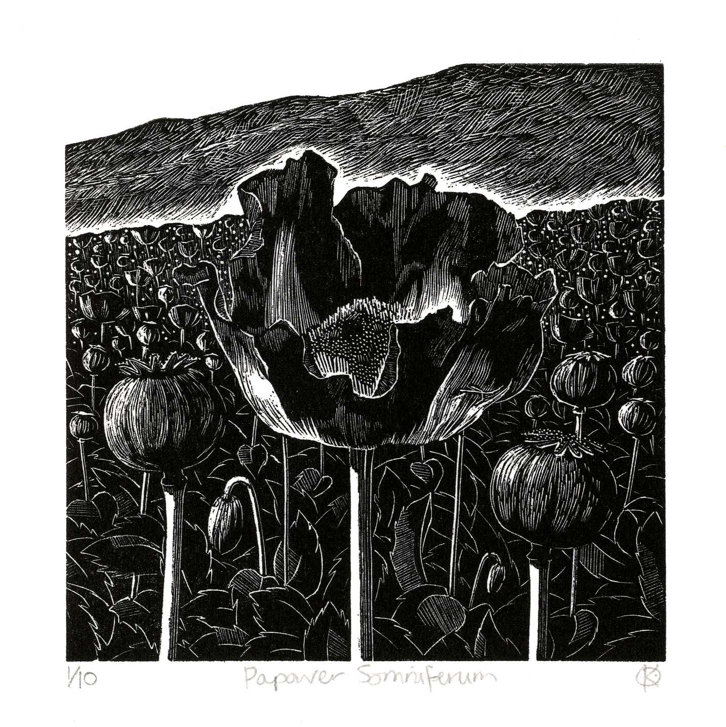
In 2021 the troubles in Afghanistan prompted an edition of prints for the 20:20 print exchange run by Hot Bed Press, illustrating the opium poppy fields ‘Papaver Ultramarinus’, printed in an ultramarine colour, derived from Lapis Lazuli mined in the Hindu Kush. A small edition printed in a more sombre black ‘Papaver Somniferum’ followed, and was thrilled to hear that it was selected for the prestigious annual exhibition of the Society of Wood Engravers, now in its 85th year, at the Bankside Gallery, London, in February 2023. From here it spends the year touring the country, exhibiting at five other galleries.

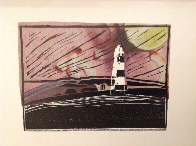
I attended a course at West Dean College in 2021 with the SWE elected wood engraver and sculptor Harry Brockway. I have admired his unusual pattern making approach to wood engraving that draws on his technique as a sculptor. I engraved ‘Fawley – across Southampton Water’ in memory of Fawley Power Station (a fine example of brutalist architecture which was being demolished), which was selected for St Barbe Open in 2022.

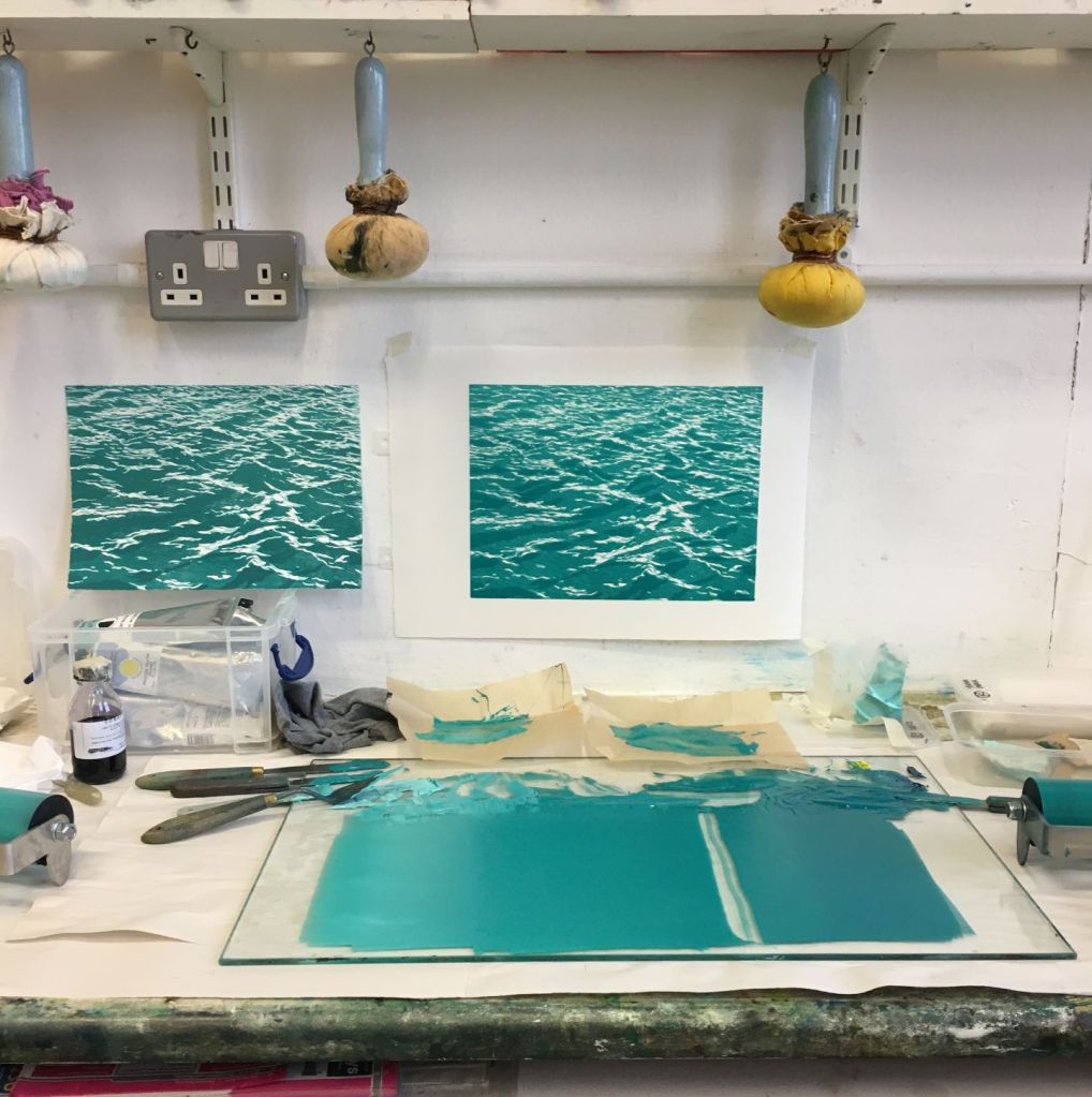
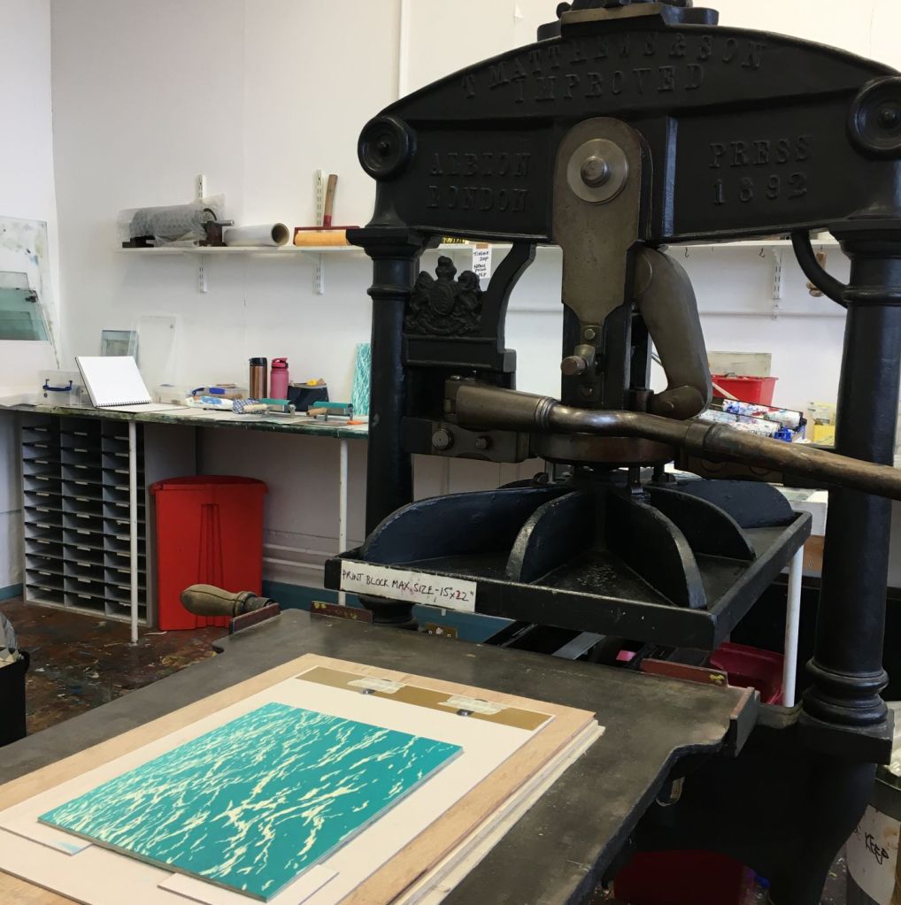
The native shells of the Solent, washed up on the shores of Hamble Common, provided me with the subject for my next engravings, titled ‘Solent Seashells‘. It was during 2022 RHP decided to close its doors and I joined Portsmouth Printmakers (previously Omega Printmakers) at the Omega Centre in Portsmouth, attracted by its magnificent 1892 Albion press as well as excellent well equipped print studios.

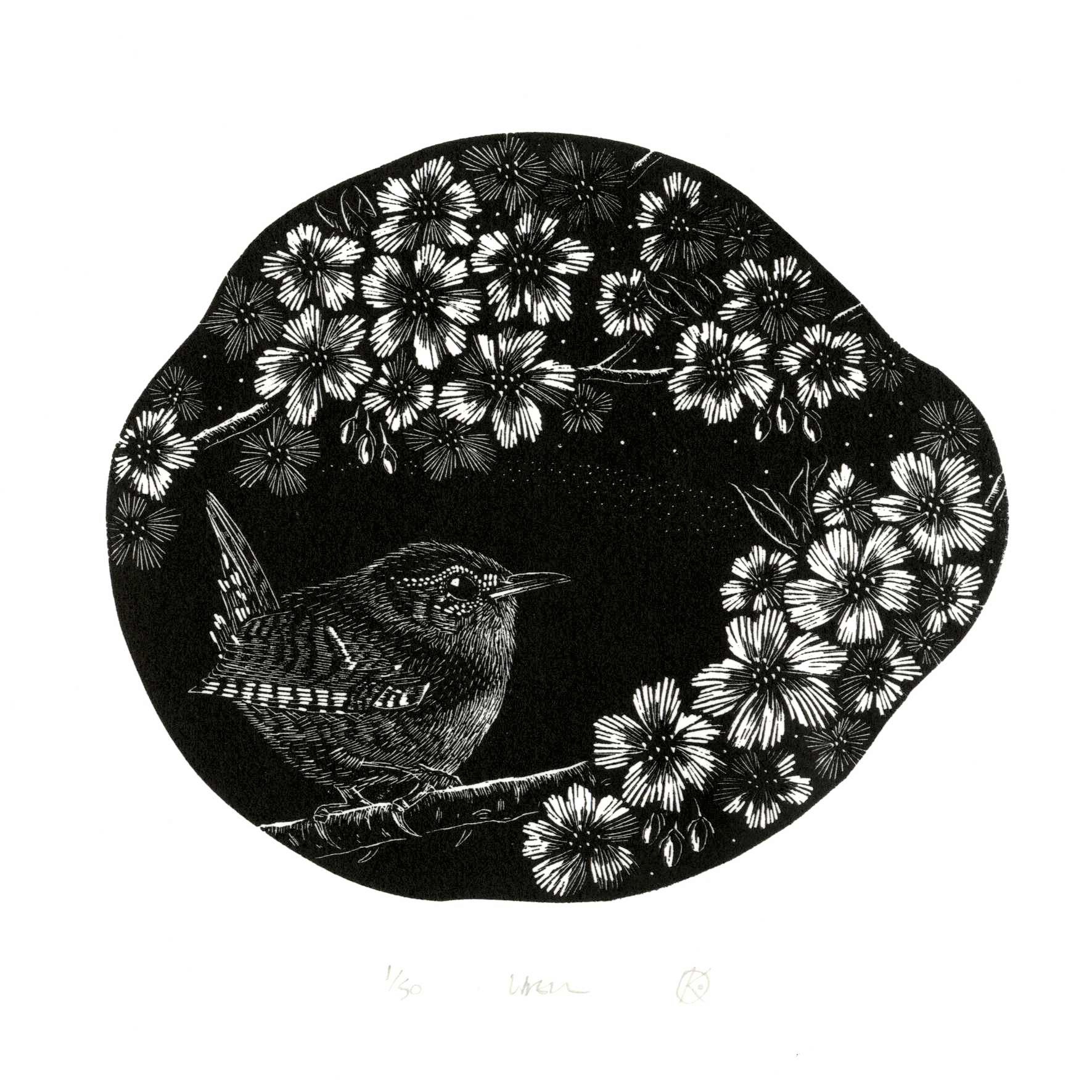
I also enjoy poetry and so when I saw the Open Call from the Scottish Ornithologist Society to create a design inspired by a poem I thought this might be an interesting challenge. I found a beautiful short poem by Scottish poet Richard Price that reminded me of the little wren that flits around our great white cherry tree – an ideal subject for an engraving on a boxwood round! My print ‘Wren’ was selected and was on show at their headquarters at Aberlady near Edinburgh during the summer 2022.

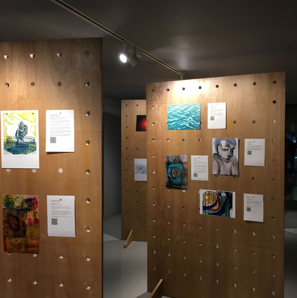
Following interest in my wood engravings at the Portsmouth Printmakers exhibition at the Jack House Gallery in Portsmouth, they invited me to run an introduction to wood engraving course in February 2023. It was really rewarding to see everyone develop their confidence through the weekend and produce some fantastic prints at the end of this quite intensive course. All are keen to continue to develop their skills so more courses are being planned for the autumn.

So what next? As one of the only wood engravers in Cowprint Artists’ Group and at Portsmouth Printmakers I would like to see more of our members ‘drawing with light’ and exploring this technique. I hope that the success of my recent wood engraving course will see a new group of wood engravers emerge and through exhibitions introduce this unique technique to new admirers and print collectors.

As for me, I still have much to learn about the technique; I want to make more use of the pattern making qualities of the engraving tools and I am excited by the use of colour in wood engraving using multiple blocks and the potential for combining the technique with other printmaking techniques – so watch this space!

‘Solent Green’ sold at charity auction

This print was created in response to the Open Call by ‘a space’ arts to celebrate International Women’s Day 2022, by hosting a silent auction of artworks by female identifying artists, following a two week exhibition at ‘a space arts’ flagship venue, God’s House Tower (GHT). The print was sold on 8 March 2022, along with many other works of art, raising £1500 overall for local charity Yellow Door which helps victims of domestic and sexual abuse, and it was really good to support this worthy cause.

My print uses three shina plywood plates printed with blue /green inks to create a complexity of rhythmic patterns that give the effect of light reflected off waves. Use of blended ink colours on the second and third plate bring a sense of perspective to create depth. The image is based on a photo taken at Newtown Creek, a beautiful National Trust nature reserve providing a safe haven for sailors to put down their anchor for the day, or night, and popular with bird (and seal) watchers, on the north western coast of the Isle of Wight. The colours chosen reflect the colour of the Solent, the sea between the mainland UK and the Isle of Wight, where I have spent many days sailing, and, on a sunny day, the sunlight makes the sea a beautiful green, almost emerald colour; hence the name ‘Solent Green’.

I decided to print the plates as a bleed print (i.e. no border that would need to be float mounted), printing onto A4 sized (the required size for submissions) 300 gsm Somerset White Satin paper with deckle edges using Schmincke Linoprint Inks. These are waterbased and have some transparency but not as much as the oil based Caligo Safe Wash Relief Inks I normally use. But they have one big advantage – they dry very quickly and can be overprinted the next day. As I had spent so much time developing my design for the submission I had run out of time to use the oil based inks as they would take at least three weeks to dry, even using driers. I also decided not to print an edition due to the lack of time so this resulted in a unique print with just one artist’s proof.

The print was a great success, getting off to a good start when bidding opened and received lots of positive comments.

As the print seemed a success I decided to print a second edition ‘Solent Green II‘, printing the whole plate using oil based inks onto a larger sheet of smooth 145gsm Zerkall print paper so that the print had a border allowing it to be mounted traditionally (the photo below shows the original print using Schminck inks on the left and the one using Caligo inks on the right) . My presses at home can only accommodate a plate just larger than A4 in width so this meant a trip to Omega Printmakers in Southsea to use their magnificent 1892 Albion Press.

The print is inspired by Ayomi Yoshida (b. 1958), a printmaker and installation artist. Six years ago, early in my printmaking journey, I came across her work in a book by Avril Vollmer on making woodblock prints. Researching her work online I became captivated by her distinctive use of the gouge for mark making, her rhythmic repeating patterns, and, in particular, her abstract seascapes, which have a strong synergy with my own fascination with the sea, wave patterns and reflected light. Ayomi comes from a long lineage of Japanese artist printmakers, the Yoshida family, stretching back over 150 years, and unusually, is the third generation of female artists. Interestingly, like me, she studied architecture, but in Tokyo (I was at Sheffield University – a bit of a difference!), and while writing her graduation thesis in California she began exploring silkscreen printing but turned to woodblock printmaking when she could not find materials needed.

New logo design

I have enjoyed designing cards over the last year and so, in February, I decided to buy a refurbished Adana 8 x 5 letterpress from Caslon Ltd. Amazingly this company is still in business 300 years after William Caslon cut his first typeface (of that name) in 1720. Whilst waiting for it to be delivered I started to develop my logo, initially sketching out ideas based around the tagline “hand printed by the sea” that I print on the rear of my cards using a simple rubber type printing set. I realised I could have the design made into a photo polymer plate at Lyme Bay Press, just over the Solent on the Isle of Wight. So I set about designing it in Adobe Illustrator, a programme I hadn’t used before but was fairly easy to get to grips with, having used InDesign and Photoshop.

I ordered the thicker 1.52 mm plate on a type high block which made it a little high for setting along side type so it needed a little sanding to get it to the right height. I tried it out initially with my wood engraving of a Koi Carp which I had reworked by clearing away the background to leave just the fish and some bubbles! This made a great greetings card with the addition of a little ditty!

Having had the photo polymer block made it now seemed more appropriate to the “hand printed” ethos to engrave my own logo. So I simplified the design changing the type face from Perpetua to Comic Sans to make it easier to engrave. I also took the opportunity to develop the design, strengthening the circular feature to mimic a ship’s porthole or portlight. I mirrored the image and photocopied the design onto a sheet of OHP inkjet film. The ink isn’t absorbed so if you are very careful you can transfer the wet image to the wood block without it smudging. I have engraved one block of lemonwood with a positive (black on white) image and will do another in reverse (black lines will be engraved away). I’m really pleased with the result though it will take a bit of cleaning with a toothbrush to keep the printed image sharp.

The new logo now adorns the rear of my gift cards with some additional letterpress type describing the printing techniques used.

Some of my greetings cards are available to buy in my Etsy shop and Folksy shop.

A print to commemorate the sailing of the Mayflower in 1620

This blog was written to accompany the online exhibition at God’s House Tower in Southampton ‘Navigating a New World: Mayflower 400′ launched in December 2020. It includes a number of artists prints from Cowprint Artists’ Group including my own print and cards ‘Downwind off Cape Cod’. We hope that the exhibition will open at GHT later in 2021.

Prints and cards available at GHT

I had spent over two months during the winter 2019 developing a number of ideas for my print when I finally decided to develop one specific idea to try to capture the sense of arrival the Pilgrims might have had approaching Cape Cod. I tried to imagine the scene on November 10th 1620, when, having faced treacherous seas off the Monomoy Shoals and strong head winds in a valiant attempt to reach northern Virginia, the Mayflower’s Captain reluctantly ordered her sails to be freed and to return downwind to seek the shelter of Cape Cod Harbour. It would have been bitterly cold on deck but a small group gather, hearts filled with the mixed emotions of trepidation and excitement of what lies before them. This scene brings back memories of my own adventures sailing across the Atlantic, and the stark contrast in experiences of that journey 367 years later.

Refining the design and transferring to the plywood block

In order to create a realistic image I needed to find some photos of a square rigger sailing and managed to find video footage online of the Mayflower II sailing off Brixham (where the replica had been built) in 1957 and from this I began to sketch out what the Mayflower might have looked like under full sail. I had also researched what Cape Cod actually looked like when approaching from the sea, both from recent photos and from descriptions in a seventeenth century English Pilot as well as Mourt’s Relation, an account of the plantation settlement, believed to have been written by Edward Winslow, one of the leaders of the Pilgrims, a few years after they had settled in Plymouth, Massachuesetts.

Cutting the design into the plywood veneer

I used plywood veneered sheets for my printing plates as I wanted to use the wood grain to create texture in the print, given that the Mayflower was a traditional wooden boat. It is important to select a grain that will work with the desired effect and for the finer cuts the grain should go with the direction of cut to avoid bits chipping off. Having finalised my design I transferred this to tracing paper and traced a mirror image onto a plywood veneer plate. This would be my key block holding the black outline of the design. I then transferred the design to a second plate which would hold the blend of colours forming the background of the sea, sky and the Mayflower. I then started to cut away the veneer that I didn’t want to print using very sharp bladed wood cut tools. Once both designs had been cut into the plates I proofed them, test printing them and refined the designs ready for editioning.

Proofing and refining the printing plate
The two plates ready for editioning

In order to get the smooth blend of colours representing twilight I arranged a number of different coloured inks across my inking plate and using a combination of rollers to blend the inks to get the colours I wanted. This was quite tricky and impossible to replicate from print to print as the more you blend the inks the more they change colour. This meant having to start reblending the inks from scratch several times to keep the colours as I wanted. I was also keen to use the orange colour to represent the timber of the Mayflower’s mast and deck which meant carefully removing the dark sky colours with a cotton bud and re inking the mast and ship with an orange / brown ink. Once the ink was dry I inked the key plate, taking care to get the registration correct, and printed this over the impression from the first plate to create the final print.

Blending the inks and applying the ink to the plate

Printing a wood engraving with letterpress founts – my ‘LOVE is … Pink Ferry’ card

Following the success of my Pink Ferry linocut I thought that the Pink Ferry would also make a good subject for a wood engraving. I had also been thinking about designing a card for St Valentines Day using my newly acquired letterpress founts and seeing if I could successfully print both these and a wood engraving. I had tried this first with my Sea Fever card but had run out of time before Christmas to get consistently good prints and realised that the combination of printing pressure, make-ready packing and printing ink were not quite right.

I set about designing a simple silhouette of the ferry on tracing paper, transferring the image using red carbon paper onto a lemon wood block that had been dyed black with a light wash of Quink ink. I was a bit undecided how to depict the water so developed this as I proofed the block. I also decided to include a border to support the ink roller when inking up and to try avoid the cleared areas picking up any ink.

I then locked up the block with the typeface in a chase (called a forme) which I had already composed in 14 and 12 pt Perpetua, with spacing furniture and leadings. I then moved the chase to the moveable bed and checked all the typeface is flush with the bed by loosening the chase slightly and ‘planing’ the forme, using a flat block of wood (a planer) and a mallet or similar to gently tamp down the type before the chase is locked up tight. Initially, my proofs showed that the 14 pt ‘LOVE’ was out of line with the 12 pt ‘is …’ and needed a hairs width of spacing to lift the 12 pt up. I found that a small cut piece of Zerkall 215 gsm both above and below the 12 pt worked a treat!

I currently use an old cast iron Waterlow & Sons copying press to print my letterpress and wood engravings as a cheap alternative to a semi-automated press such as an Adana or Albion. I place the block or chase on a moveable bed made from a rigid flat board covered with a thin sheet of clear acrylic (marked up for registration) which I slide under the platen. You apply pressure by screwing down a platen and with a small block like this a hand tight pressure, with only two sheets of newsprint protecting the card to be printed, seems adequate. The platen seems to apply more pressure to the top left of the block and least pressure to the bottom right so the make-ready needs to be adjusted accordingly.

After quite a bit of trial and error I finally got the underlay and overlay of make-ready producing good prints. I used the blocks of wood as bearers to support the card, stuck down with tape.

I used a strip of newsprint over the card to improve the printing of the lower border. I also added a small square of newsprint over ‘share’ for the same reason.

I cut out a registration card for both the front and rear of the card (using my rubber stamp logo on the rear).

I’m very pleased with how this design and its printing has turned out but I suspect that if I had used a traditional letterpress ink instead of the Caligo Safe Wash Etching Inks I would have got better results still. Another lot of inks to purchase!

For more details see here – https://kayabrown.co.uk/portfolio/love-is-sharing-a-ride-on-the-pink-ferry/.

My print entry for the 20:20 Print Exchange 2019

In September this year I entered the 20:20 Print Exchange with nine other members of Cowprint, the printmakers group associated with the Red Hot Press. The exchange is run by the Hot Bed Press in Salford, UK and has been running annually since it was set up in 2009 with an exchange of prints between the Red Hot Press in Southampton and Hot Bed Press. The project has grown rapidly with this year a record 18,300 prints from 732 artists and 45 workshops and groups as far afield as Moscow, Hong Kong and Canada.

Each artist is asked to produce a new edition of 25 prints on paper sized 20 x 20 cm. In return each artist receives a box set of 20 randomly selected prints including one of their own.

My entry was this four plate wood cut of the Magnolia in our back garden. In late Autumn the leaves turn shades of golden yellow and orange and in the morning light it shines like a beacon against a darker backdrop of woodland. The tree overhangs the lawn and I often wonder what it would be like if the lawn was a large pond instead. We often get damsel flies in the garden so it seemed appropriate to include a couple hovering over the imaginary pond.

Earlier this month Cowprint members gathered together to receive our boxes – there’s a lot of anticipation as to what type of prints you might get and where they might come from I was very pleased with my box which included some really beautiful prints and such a wide variety of techniques and subject matter.

For more details of my print see Autumn Magnolia and you can see my collection of prints from the box set below:

‘Erosion’ selected for Southbank Printmakers Mini Print Open Exhibition 2019

Editioning

I saw this exhibition promoted on Instagram and thought I would give it a go and was thrilled to find out my wood engraving print ‘Erosion’ was selected. The exhibition opened on 1 May and runs until 2 June 2019 at the Southbank Printmakers Gallery, on the Southbank near the Thames (Gabriel’s Wharf), London. One of the prints was sold before the exhibition opened which made me think I ought to finish editioning the print pretty quickly.

I had been thinking about getting a platen press for a few months allowing me to print onto a heavier weight paper at home. I would love one of those beautiful antique Albion table top presses but they are very expensive and difficult to find so I looked on eBay for a cast iron copying press. I managed to find a bookbinder wanting to sell on a Waterlow and Sons, London Wall press at a reasonable price and picked it up last week. It is a rather odd lemon yellow colour over painted with black but, having given it a good clean, it seems to be in good working order and maybe one day I’ll strip it back and repaint it… one day!

My workstation set up in my studio

Having searched the web for any information on using a book press for printing I found a few threads on wetcanvas.com on how to set up a sliding board with a registration plate to make it easier to put the block under the press. I was really pleased with the results – getting better prints than using a galley press.

Registration plate located centrally under press

I used the small polypropylene board that came with my Xcut Xpress with a polycarbonate registration pate marked up with a cm grid on top.

I experimented with different pressures and found that a single sheet of newsprint with a layer of craft felt on top gave a good result. I used a few blocks of softwood and a card registration plate on top to aid placing the paper ready to print.

The press has short screw handles (some have large brass knobs on the end). This seems to be its original design – may be it was a work horse press so didn’t need to look ‘pretty’! I did try putting some extra pressure on with a cut off scaffolding pole but that seems to create too much pressure in the far left hand corner so it seems that I can put on enough pressure without it.

Editions done and hung up to dry

‘Erosion’ selected for St Barbe Open 2019

Im really excited today as St Barbe Museum and Art Gallery in Lymington have selected this wood engraving for their forth coming Open Exhibition which starts on 23 March and ends 2 June 2019. This is only my second wood engraving, completed on an introductory course at the Red Hot press, Southampton in January 2019 with tutor Jutta Manser. This is also my first entry into an open exhibition too! Cant wait for the exhibition!

For many years we have walked the coastal path along the edge of Hamble Common looking out on to Southampton Water and to the New Forest and Isle of Wight beyond. Each winter the storms batter the soft clay and shingle shore line and clumps of the grassy banks gradually fall into the water and are washed out to sea. This winter I joined Hamble Conservation Volunteers to do occasional beach cleans and was surprised to see how far the banks of the Common have been eroded. What was really fascinating was how the clumps of grass work their way down the beach with each successive tide, gradually being eroded and appearing like tufts of hair rising above the incoming tide. This wood engraving image tries to capture the scene looking back towards the shore, across the shingle beach, as the tide comes in to claim more of the grassy clumps.

After finishing the course I set about editioning the wood block which was much harder than I thought it would be; getting the press set at the right height/pressure and just the right amount of ink to avoid loosing the crisp lines of the engraving. After a bit of practice I got the hang of it and managed to get some decent editions done.

For more information on the print see https://kayabrown.co.uk/portfolio/erosion/ and for my first wood engraving ‘Koi Carp’ see https://kayabrown.co.uk/portfolio/koi-carp/

First wood engravings

In January I completed an enjoyable four week introductory wood engraving course at the Red Hot Press with Jutta Manser. The first week we practiced mark making on engraving plastic and selected an image to produce on a small block of lemonwood. I chose a 3 x 5 cm block which perfectly fitted the proportions of a photo of a Koi Carp. The second week we started to engrave our image. I have much admired Agnes Mills Parker’s engravings from the 1920’s and how she used strong contrasts of black against white to bring her subject matter to life and this image really lent itself to this approach.

Working on the Koi Carp image

Having got the Koi Carp block to a reasonable state to get some good clean proofs I moved on to designing my ‘Erosion’ block. I chose a 7 x 9 cm block and engraved the design so that I could proofed it along with the Koi Carp at our last session. Jutta had selected a number of different printing papers for us to try out and I found that the Zerkall handmade printing paper (210 gsm) from Great Art worked well with the relief press. I also tried hand burnishing with a little Yew sugar spoon my mother gave me which worked very well with the lightweight Okashi Japanese paper (29 gsm, also from Great Art) and another lightweight creamy paper (unidentified).

First wood engravings

I was very pleased with the results and how I had been able to develop my recent fine linocut techniques to these intricate designs using the very fine mark making that can be achieved with wood engraving. Jutta’s years of experience in wood engraving was also was much appreciated!